Saturday, 15 May 2010

Business Card


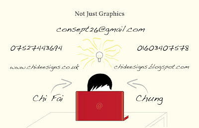
This is the back of my business card. Not Just Graphics establishes what I really do. People had written graphic design, visual communications or both. I thought to say the same thing but in a different way. So Chi Deesigns, Not just Graphics. A way of saying I'm a graphic designer and can do more. Then consept26 (sept 26 is my birth day, by the way i didn't spell concept wrong) says I'm more of an idea person, changed email from baller_chi2005@hotmail.co.uk, because it's completely irrelevant in terms of design. If i have kept it on here, the communication of this design will be so much weaker. Illustration of light bulb supports it, each brush stroke represents an idea coming from different angles taking it to different directions. The information appropriate for it is composed nicely I think there's enough space for the type to breath, and bring forward what I want them to read first which is email and numbers. I am aware that there's two different languages in this design, because of the logo, and illustration with a different type, but it adds to it, as I describe myself a person with mixed interests. The font I used is called Volkorn for my logo and not just graphics. Handwriting - Dakota, a font that looks like my own handwriting, works nicely with my little illustration. People who knows me or even walked in our studio will understand it, but for the people I am aiming this at will not. So I used arrows to fill the space that I really didn't like pointing out, that's actually me on my macbook. In the end, I want my business card to represents me.

Business Card


This is the front of my business card showing my identity. I have chosen to keep it simple. I think it's strong enough to catch someone's attention and communicate what i do. Well, roughly as there are some elements of musical symbols in my logo, I don't want people to think I'm a musician applying to the wrong job. So decided not to bring anymore elements of music in this business card leaving subtlety of this idea as a background of myself. As music does relate to me, my creative CV (a manuscript) and for my first point of contact (piano song played by me and animated) my website will be in theme of music too, but not too much of it, enough to say i play as a hobby not as a career. The reason of how i composed my logo is explained on my previous post, changed from Chi Deesign, to Chi Deesigns because it sounds better.

Monday, 5 April 2010

iPhone promotion


This is a free App that promotes a Swiss brand fragrance. This is very interactive, it gives you 3 choices of games, all of them requires you to collect the product in climbing, parasuiting, and sky diving. Everytime you lose the game it tells you your score then displays “Why wait to go beyond your own limits!” Then it introduces the products, and they are very expensive! It also gives you the option to buy online. The games are related to Swiss as there are alot of snow in the country. A very nice way to promote a product through an iPhone.


Thursday, 18 March 2010

Future Car


I came across this during my research on packaging, and it was just interesting to see how they incorporated ideas from pilot, Ridgeline, Element, Civic Coupe and Civic Si Coupe, into one. To me it looks interesting but not the type I will be interested in, the name P-Nut sounds unattractive to me personally. As I'm doing project which has a similar thing of combining elements of two products into one, this is inspirational of how they managed to do it, so that we could instantly see those elements incorporated.

Wednesday, 10 March 2010

Fragrance Advertising iPhone App


Hot Water by DAVIDOFF. This app needs to clarify that the person is over 18 to download. The way they approach this is by having every picture covered by condensation as hot water in shower would in reality. This requires interaction from the user to wipe it off and view the images. There is about 8 images in this app, they all try to look sexy, and some of them show the brand and the actual product. I think if only the images are better this would improve not only this app, but also the marketing side of this product. After the first 3 images I just got bored, and would never consider buying it. The whole concept of this app is very strong as it does tie into the actual name of product “Hot Water” that creates the condensation, and the interaction side of it is also a very nice aspect of this app. On the top left hand corner there is a button that allows users to see videos on YouTube, and a link to facebook to become a fan of this brand. It would be better if there was a link also, that connects to their website to purchase the product. Otherwise I think this app is more or less pointless in regards of selling, it doesn’t feel like it’s going nowhere without the information that consumers need to purchase it.

Sunday, 7 March 2010

My self promotion identity


This is my self promotion identity final idea. I chosen to name myself Chi Deesign for a number of reasons but the important one is to pronounce my name correctly "Chi", and the e's can be used to form musical quavers that links into my creative CV, business cards, etc, as they are all related to music, and it does tell a bit about my self. The lines that looks familiar in typography books where they analyze the type (serif, bowl, decender, acender, x hieght), also looks like the stave you see in piano music. So there's this cross link between the two design plus music. I know having the two seems like soy sauce and ketchup mixed together, but i tried to be different! Please give honest opinions!


Thursday, 25 February 2010

4 Designers quotes, and advice.

Design Council - David Kester

"Where does design come in? Design isn't always what we think it is, design is normally the way we think about things right from the beginning of a problem and actually using it to understand the problem."

Someone - Simon Manchipp, Gary Hall, David Law

launching/relaunch and managing brands.
Their opinion "Logos are dying, as it is expensive, not very useful, confusing and boring"

(I strongly disagree! Logos and branding works together my opinion is that a brand must have a logo for a business to expand. Logo on it's own can sometimes leave question marks in our minds, this is where branding comes in to established what it is, the logo acts as a device that can then be applied with the brand identity to anything that will convey, who they are, what they do and where they from. once the brand identity and logo are seen together from it's demographic then the logo acts as a sign, a mark of identity on its own.)

Everyone has opinions what's yours?


Mike Dempsey

Tips of being a good designer

Look - really see can find solutions staring at you
Read - many ideas come from reading, read the copy your given
Ideas - look for ideas in project
History - absorb all previous experiences
Passion - passion is infectious
Curiosity - got to be curious to look for things and may find the solution to your problem
No - be persuasive and push
Rules - learn the rules before breaking them
Words - not just visual
Voice - is an instrument never underestimate, to communicate effectively
Ego - got to be different
Rejection - learn from it, get up and fight another day


www.mikedempsey.typepad.com