Monday, 20 September 2010

Peking Restaurant


This pic was taken in a Peking Duck restaurant in Beijing. This is actually a post card for every customer it states the number of duck you've eaten in the restaurant, we had the 27429th duck. The purpose of this is to send it to a friend to tell them about this Peking restaurant, to increase awareness, this is actually a well known Peking Restaurant in China. Nice shiny stamp on the back to tell its real, I suppose it makes it seem unique. Everything is good about the restaurant and great service, but the location isn't good enough.

Wednesday, 1 September 2010

What now?


My Ambition

This picture is taken in "The Place" in Beijing. That's right Beijing! I have been away for nearly two months, went to Zhuhai, Shenzhen, Beijing, Shanghai, and Hong Kong. The main part of this holiday was to see new ideas and take inspirations in new technology, and also visiting the Expo in Shanghai which was an experience I never forget. Being away for that long makes me feel like I'm so behind in looking for jobs. I have sent my first point of contact to an agency in London today, hopefully I get a reply from them soon. If i fail, there is alternatives, I go back to study next year for MA not in Norwich.

I have seen so much in China, and realized the advertising and branding over there is unbelievable, makes any ideas seem possible to achieve! My ambition is to be creative director in China where the real money is, it is where I would like to be in 25 years time!

By the way, the picture shows an 50 meter long LED screen with speaker mounted on each stands. Used to show music videos, advertising, and also people can send text messages to it, to show up so EVERYONE could see, think it was round about £1.20 per text. Why do people do that? I guess it's to interact with the audience using this amazing display for fun.

Tuesday, 29 June 2010

iPhone 4


Chapelfield Norwich people who had reordered the iPhone 4 had to queue and this pic is taking on the day of release 30 minutes before opening. I have taking a pic of the tariff if your interested. There is no upgrade available for orange as far as I'm aware, but 3 network have some good deals, but the connection is shocking highly not recommend 3 network. I heard some rumors about signal failure as the whole body of the phone is the antenna when holding the phone, the signal bar goes down. Apart from that the phone is very nice.

Sunday, 20 June 2010

Nikki for Nina Ricci/Packaging


This is the packaging for Nikki a fragrance designed for Nina Ricci. This is a fusion from the previous two product named Nina and Ricci Ricci. The bottle was designed in blender 2.5, which is a 3D software available to download for free, but bear in mind that there is lots of bugs. I highly recommend this software if you must use 3D rendering, but keep in mind learning this, does take a lot of time and patience. I have created a brand new product for female from the age of 16, and need to create a advertising campaign to increase awareness.

Thursday, 17 June 2010

Thomas Cook DPS

Promoting this event in Thomas Cook magazine. The idea is to book their flights and increase awareness of this event and the iPhone app which is created to plan their visit.

Expo Shanghai 2010


I have redesigned Expo 2010 Shanghai logo as part of my project. I think this says what it is very clearly and it look so much cleaner than it's existing design.

Wednesday, 16 June 2010

Piezoelectrical technology

The floor contain piezoelectrical technology. Which is a type of technology that collects kenetic energy, from people that walks o this carpet. Japan had used this to run the entire underground train station. This is extremely expensive to install but the outcome is fantastic. I had chosen to use this technology in my energy saving LED Samsung project where customers is actually helping the environment by simply walking on the green carpet where piezoelectrical technology is installed underneath, and my digital animation will be shown to explain why should everyone buy Samsung's LED TV.

Saturday, 5 June 2010

The AMAZING iPad


The iPad had arrived to UK on 28th May 2010. The prices starts from £429, which is very expensive. They have so far released the Wifi 8g and 16g and the 3g type is coming soon and the price for the most expensive iPad is around £750. I think this iPad is nice, but feels unconfortable when trying to do something on it while holding on one hand. I personally would not buy this product for that price.

Saturday, 15 May 2010

Business Card


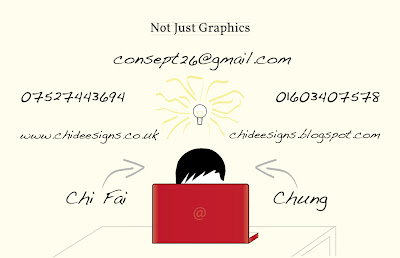
This is the back of my business card. Not Just Graphics establishes what I really do. People had written graphic design, visual communications or both. I thought to say the same thing but in a different way. So Chi Deesigns, Not just Graphics. A way of saying I'm a graphic designer and can do more. Then consept26 (sept 26 is my birth day, by the way i didn't spell concept wrong) says I'm more of an idea person, changed email from baller_chi2005@hotmail.co.uk, because it's completely irrelevant in terms of design. If i have kept it on here, the communication of this design will be so much weaker. Illustration of light bulb supports it, each brush stroke represents an idea coming from different angles taking it to different directions. The information appropriate for it is composed nicely I think there's enough space for the type to breath, and bring forward what I want them to read first which is email and numbers. I am aware that there's two different languages in this design, because of the logo, and illustration with a different type, but it adds to it, as I describe myself a person with mixed interests. The font I used is called Volkorn for my logo and not just graphics. Handwriting - Dakota, a font that looks like my own handwriting, works nicely with my little illustration. People who knows me or even walked in our studio will understand it, but for the people I am aiming this at will not. So I used arrows to fill the space that I really didn't like pointing out, that's actually me on my macbook. In the end, I want my business card to represents me.

Business Card


This is the front of my business card showing my identity. I have chosen to keep it simple. I think it's strong enough to catch someone's attention and communicate what i do. Well, roughly as there are some elements of musical symbols in my logo, I don't want people to think I'm a musician applying to the wrong job. So decided not to bring anymore elements of music in this business card leaving subtlety of this idea as a background of myself. As music does relate to me, my creative CV (a manuscript) and for my first point of contact (piano song played by me and animated) my website will be in theme of music too, but not too much of it, enough to say i play as a hobby not as a career. The reason of how i composed my logo is explained on my previous post, changed from Chi Deesign, to Chi Deesigns because it sounds better.

Monday, 5 April 2010

iPhone promotion


This is a free App that promotes a Swiss brand fragrance. This is very interactive, it gives you 3 choices of games, all of them requires you to collect the product in climbing, parasuiting, and sky diving. Everytime you lose the game it tells you your score then displays “Why wait to go beyond your own limits!” Then it introduces the products, and they are very expensive! It also gives you the option to buy online. The games are related to Swiss as there are alot of snow in the country. A very nice way to promote a product through an iPhone.


Thursday, 18 March 2010

Future Car


I came across this during my research on packaging, and it was just interesting to see how they incorporated ideas from pilot, Ridgeline, Element, Civic Coupe and Civic Si Coupe, into one. To me it looks interesting but not the type I will be interested in, the name P-Nut sounds unattractive to me personally. As I'm doing project which has a similar thing of combining elements of two products into one, this is inspirational of how they managed to do it, so that we could instantly see those elements incorporated.

Wednesday, 10 March 2010

Fragrance Advertising iPhone App


Hot Water by DAVIDOFF. This app needs to clarify that the person is over 18 to download. The way they approach this is by having every picture covered by condensation as hot water in shower would in reality. This requires interaction from the user to wipe it off and view the images. There is about 8 images in this app, they all try to look sexy, and some of them show the brand and the actual product. I think if only the images are better this would improve not only this app, but also the marketing side of this product. After the first 3 images I just got bored, and would never consider buying it. The whole concept of this app is very strong as it does tie into the actual name of product “Hot Water” that creates the condensation, and the interaction side of it is also a very nice aspect of this app. On the top left hand corner there is a button that allows users to see videos on YouTube, and a link to facebook to become a fan of this brand. It would be better if there was a link also, that connects to their website to purchase the product. Otherwise I think this app is more or less pointless in regards of selling, it doesn’t feel like it’s going nowhere without the information that consumers need to purchase it.

Sunday, 7 March 2010

My self promotion identity


This is my self promotion identity final idea. I chosen to name myself Chi Deesign for a number of reasons but the important one is to pronounce my name correctly "Chi", and the e's can be used to form musical quavers that links into my creative CV, business cards, etc, as they are all related to music, and it does tell a bit about my self. The lines that looks familiar in typography books where they analyze the type (serif, bowl, decender, acender, x hieght), also looks like the stave you see in piano music. So there's this cross link between the two design plus music. I know having the two seems like soy sauce and ketchup mixed together, but i tried to be different! Please give honest opinions!


Thursday, 25 February 2010

4 Designers quotes, and advice.

Design Council - David Kester

"Where does design come in? Design isn't always what we think it is, design is normally the way we think about things right from the beginning of a problem and actually using it to understand the problem."

Someone - Simon Manchipp, Gary Hall, David Law

launching/relaunch and managing brands.
Their opinion "Logos are dying, as it is expensive, not very useful, confusing and boring"

(I strongly disagree! Logos and branding works together my opinion is that a brand must have a logo for a business to expand. Logo on it's own can sometimes leave question marks in our minds, this is where branding comes in to established what it is, the logo acts as a device that can then be applied with the brand identity to anything that will convey, who they are, what they do and where they from. once the brand identity and logo are seen together from it's demographic then the logo acts as a sign, a mark of identity on its own.)

Everyone has opinions what's yours?


Mike Dempsey

Tips of being a good designer

Look - really see can find solutions staring at you
Read - many ideas come from reading, read the copy your given
Ideas - look for ideas in project
History - absorb all previous experiences
Passion - passion is infectious
Curiosity - got to be curious to look for things and may find the solution to your problem
No - be persuasive and push
Rules - learn the rules before breaking them
Words - not just visual
Voice - is an instrument never underestimate, to communicate effectively
Ego - got to be different
Rejection - learn from it, get up and fight another day


www.mikedempsey.typepad.com


Wednesday, 24 February 2010

4 Designers quotes, and advice.

Thoughtful - Stuart Price, Chris Jeffrey

To be interesting you need to be interested. Take inspiration in everything you see it may come in handy when it comes to doing your designs.

Paula Scher
"Only work with the best even if it means you don't get paid."

Michael Johnson
"Prepare to do placements, have a good PDF work. If you are good it will happen."

Graduate entering the industry you got to keep yourself in their minds, because they will be busy and will forget who and how good you are, considering you will be competing against so many other graphic designers. You need to have persistence, to be able to do that you need to be different.

Micheal Wolf
"Looking for people who has appreciation of life and everybody and have no fear of their imagination"

James Carazzo
"Don't give up, if you don't give up you will get a job in design industry. Never, never, never give up."


The Chase - Lise Brian

Graduates entering the industry Top 10 Tips

Get a name and spell it correctly - don't send emails like sending to one of your mates.

Don't attach too many folders - make it easy for them to get to the point where you want them to get to

Follow up with a call - be keep them thinking about you

Be nice to receptionists - they could help you and put you through to a person who you need to see.

Got interview? - try not to be too nervous

Know something about where your going - needs to have reason why you gone for that particular job

Be enthusiastic - need to look motivated if not it gives the impression of laziness

No Jobs? - ask about placements

Turn up unannounced - Ask anyone to spare 5 minutes

Can i help? - offer to help

"Given advice? you don't have to take it!"


4 Designers Conference 22/02/10

Patrick Baglee who is the director of creative strategy navyblue found four designers eleven years ago. This design conference is for students to have this opportunity to listen to design practitioners talk about themselves, to hear about the reality of life as a designer. In this conference four designers will talk about their work and to also hear them talk about their experience in how they deal with the ups and downs of life in a creative profession.

Day 1

Thoughtful - Stuart Price, Chris Jeffrey

The Chase - Lise Brian


Day 2

The Design Council - David Kester

Someone - Simon Manchipp, Gary Hall, David Law

Graphic Journey - Mike Dempsey

We actually saw 8 designers...


Tuesday, 23 February 2010

What is the difference between Graphic Design and Graphic Communication?

Graphic commuFont sizenications reflects all changes in the industry, color science, electronic prepress and digital printing, digital image capture, color management, and flexography. Graphic communications has more to do with the industry expanding and getting products out on the market. It suggests communication through a design.

Graphic design is based on 6 principals rhythm, balance, proportion, variety, emphasis, and harmony. There are also 5 elements to graphic design as well they are lines, shapes, mass, texture, and color. Graphic design has to do with the physical product/art work of a company, the design and lay out of a product. It is basically ideas through creativity of the mind.